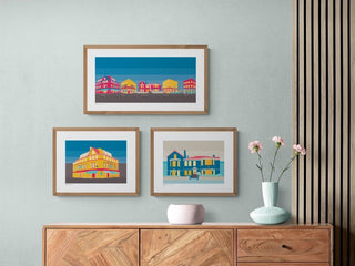
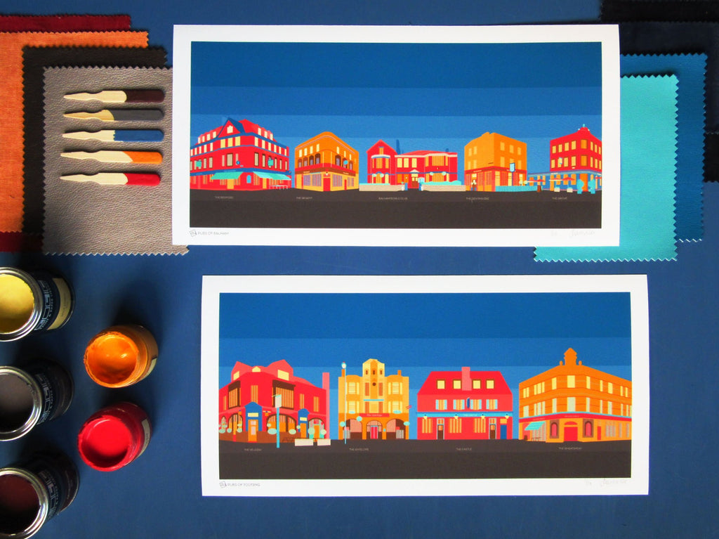
Art prints of Balham & Tooting pubs - celebrating the neighbourhood local with a thousand stories.
From Sunday roasts to nights out with friends. Perhaps it's the place you met your partner, somewhere for a quiet drink after work, or celebration evenings and quiz nights. Most of us have a favourite, much-loved local pub.
This print collection pays tribute to pubs in Balham and Tooting. The colours evoke late summer afternoons in sunny beer gardens with Pimms and pints as well as long evenings in cosy armchairs by log fires in winter.
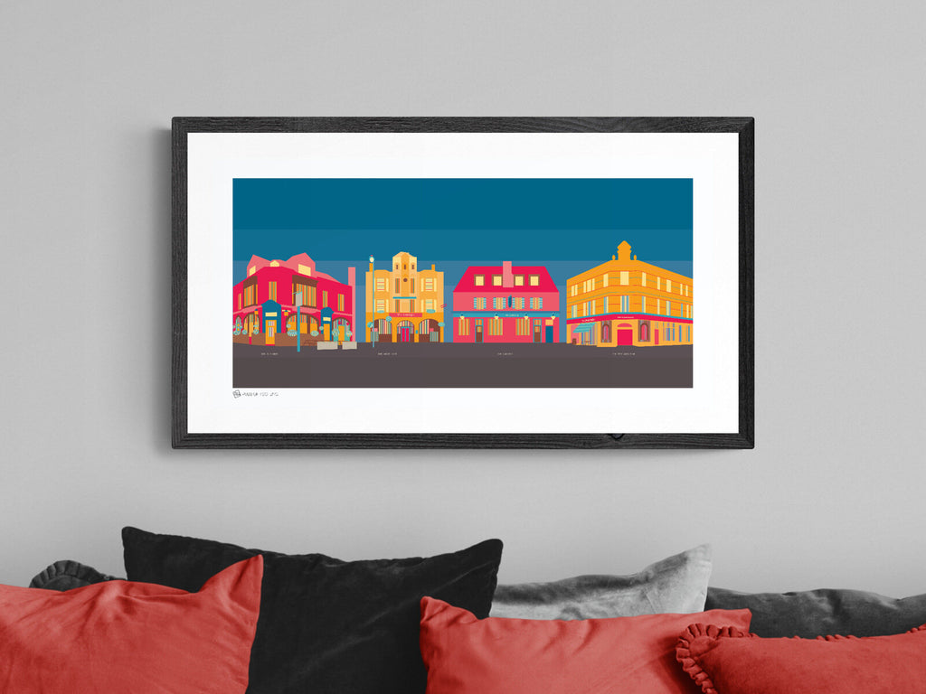
The architecture of the buildings themselves has its own stories, whether converted Victorian hotels dating back to the 1830s or old bowls clubs, often retaining a lot of the features. The prints are all intricately detailed, from signage to outdoor parasols and benches; lampposts to hanging baskets and planters.
The colour inspiration for my pubs collection
Sunlit beer gardens and comforting winter fires
The two colour themes behind this print collection are based on lazy summer afternoons outdoors alongside long chilly evenings indoors.
Although the ideas for these two themes are at either end of the seasonal temperature scale, you'll find the same set of colours in both. The palettes show how switching the dominant colours can change a mood and look, whether on an art print or within your own home. By using the same colours, the overall effect is a harmonious collection that is captivating as a set of prints whilst also creating striking stand-alone pieces. You could apply this technique to different rooms in your home, creating an instant flow.
Chilly winter evenings
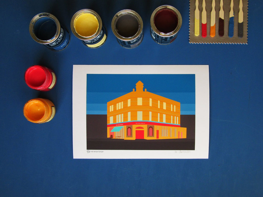
Inky blues and rich browns dominate the background of this palette inspired by Paint & Paper Library's Blue Pearl and Georgetown. Combined with accents of steely grey (Paint & Paper Library's Drakensberg), they provide the perfect complementary base to set off the warm accent colours.
Sunny afternoons
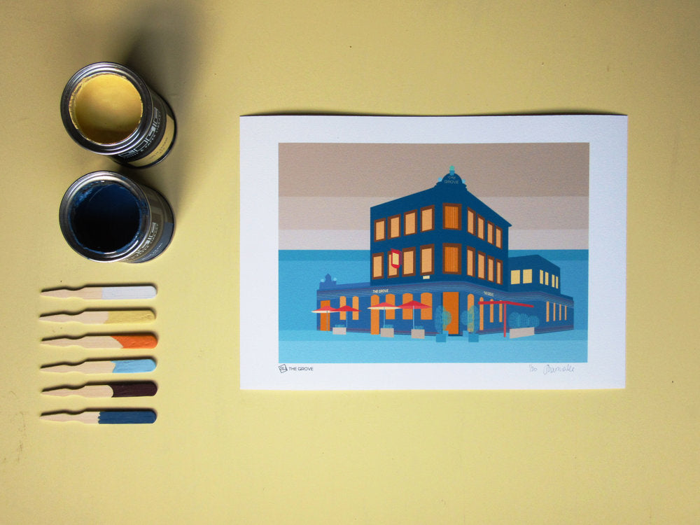
The warm colours across both palettes are inspired by Little Greene Paint Company's Marigold and Cape Red, alongside Paint and Paper Library's sunny Split Straw. They add richness and depth to the palette however they're used - small or large.