Our travel-inspired wedding with a colourful spin
When travel and places are such a huge part of your shared story, they infiltrate every little bit of your lives. Our wedding was always going to be themed around our love for travel and with my background as a graphic designer, I was always going to create a ‘brand'!
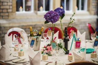
Our colourful style: a bright and bold wedding colour scheme
It was a collection of items that inspired our scheme, but one look at our home and wardrobe and you’d see the colours were perfect for us. If they weren’t already on our walls or home accessories, they were in our clothes! I wanted to create a look that captured our style; contemporary and colourful, yet with a strong sense of romance, softening the richness of royal blues and teals with gentle pinks.
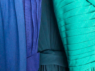
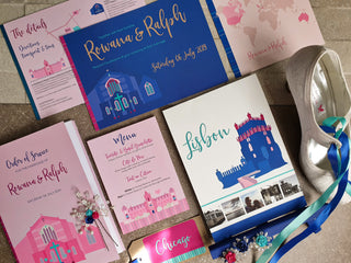
With my colour obsession, the details followed through into everything. My bridesmaids each wore a different shade of blue or teal, choosing their own dress top style. The flower girls dresses matched the colour of the pocket squares and ties for the groomsmen. Royal blue and mint ribbons used on the invitations, placecards and favours all linked back to the outfits, including my wedding shoes and hair pins!
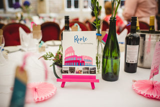
Creating a cohesive look for our travel-inspired wedding stationery
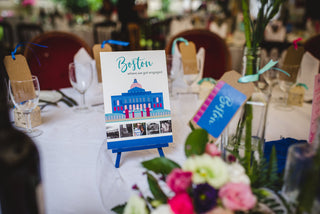
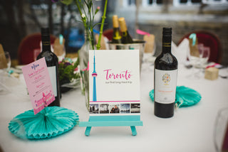
We wanted a mix of references to the places we loved, from subtle abstract details such as a striped bar inspired by boarding pass bar codes, to illustrations of our venues. The same set of elements - typefaces, colours, stripes and my illustrations - followed through into every bit of stationery, from invitations to signs on the day. The consistency created a harmonious, vibrant look whilst making everything work harder. It also helped keep us focused and on track when making decoration decisions in particular - it’s easy to get overwhelmed with the amount of choice out there!
