
Do colours of the year influence the choices you make in your home? Often released in the Autumn onwards, many big interiors paint brands have a colour they think will feature a lot in our homes over the next year.
One thing I’ve noticed is that many of 2024's colours have a soft, muted feel. The idea of creating a sense of calm seems to permeate through all the choices.
Here I’ve created visual moodboards based on paint brands in the UK, as well as Pantone.
Pantone: Peach Fuzz
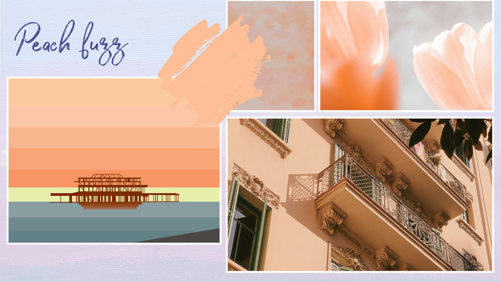
A warm, peachy hue, this colour represents kindness, connection and comfort.
Dulux: Sweet Embrace
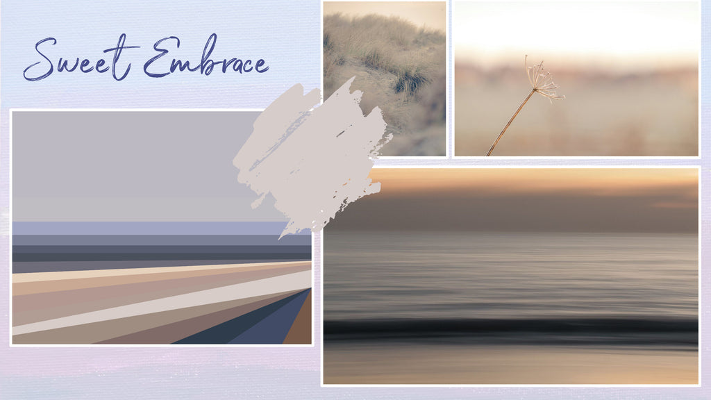
This colour brings all the cosy feels. It’s a colour Dulux describe as a soft and welcoming pink that brings peace, stability, calm and friendliness to our spaces. I’m definitely a fan of opting for warmer colours rather than cool in our home and this colour does intrigue me. I’d love to try it alongside perhaps a more overt warm pink.
Graham & Brown: Viridis
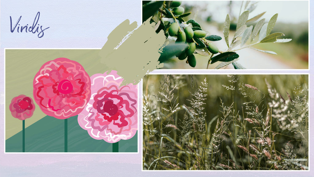
Chosen for its soothing nature, the olivey green Viridis also has a warmth to it. I’d love to pair it with some warmer blue-greens or soft pinks.
Valspar: Renew Blue
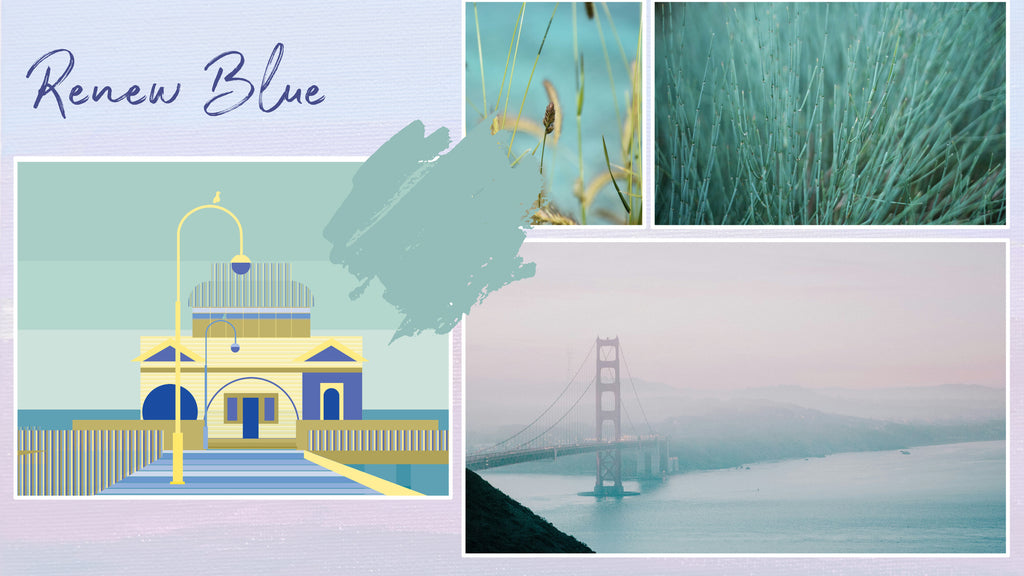
Renew Blue is a colour right up my street. A soft and warm green-blue, it has this feel of tranquility. I think it would be gorgeous in a space with some warm, creamy neutrals, perhaps some deeper blues and light wood.
Let me know what you think of these colours!
📸 the photography in the moodboards is sourced from Unsplash. The art is my own, either adapted or already matching the colours.