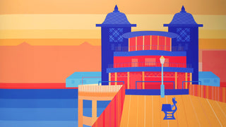
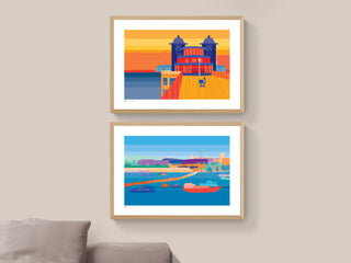
For the first commission of the Marina, Jo and I felt that a nature-based colour palette would work best as her parents had an eclectic collection of art. She sent me a few pictures of her parents home so that I could get a good feel for the colours in their art and accessories, and I brought in a few of warm oranges and purples to create harmony with what they already had.
For the second print of the Pier, Jo was trying to decide between a colour palette that was mainly reds and oranges, or one that was predominantly blues and purples. Sunsets and twilight settings were the first thoughts that came into my head. I created two colour samples for Jo to choose from, each with a completely different feel.
I used colours from the Marina commission so that the pieces would feel individual yet sit beautifully together with a subtle link between them.


